Surplus Splendour
Hollywood films of the 1950s and 60s were not simply colourful, oversized, and sonically stimulating, but all those things at once. In Silk Stockings (Rouben Mamoulian, 1957), the choral repetition of ‘Glorious Technicolor, breath taking CinemaScope and stereophonic sound’ well conveys the surplus splendour of mid-century cinema. Stopping to appreciate the commercial, technological and stylistic interplay of these elements makes that simultaneity a thought-provoking issue for study, one possible approach to which is to analyse composition.
I have perhaps trained myself to let the scope of the image take precedence over sound and colour. While researching large format filmmaking, I tend to scan shots for their overall shape and then connect nodal points in space rather than compare tonal values or listen for telling audience cues. Still, it is unsurprising to find colour forcefully announcing its compositional centrality in certain widescreen films, and while stereophonic sound has a contribution to make, visual composition will alone be sufficient to illustrate the argument.
A Large Format Colour Spectacle: The Agony and the Ecstasy
At the annual Widescreen Weekend festival in Bradford, I was fortunate to have seen a print of The Agony and the Ecstasy (1965), a historical drama directed by Carol Reed and lensed in Todd AO on 65mm Eastmancolor stock by Leon Shamroy. [1] The film interweaves artistic biography and political history, signalling the size of its subject through grandiose sets and locations that befit the era’s commercial emphasis on genre, spectacle, and film technologies.
In The Agony, Michelangelo’s commission to paint the ceiling of the Sistine Chapel is set against the backdrop of warring Papal states. The agonies of artistic composition and the political composition of the state are embodied by surface composure. Over the course of the film, Michelangelo (Charlton Heston) and Pope Julius II (Rex Harrison) both struggle to control the chaos in their individual domains, tempers flare and their bodies deteriorate.
The mutually destructive obsessions and occupations of Heston and Harrison are delicately signalled by primary colours that are sharpened and enlarged due to being captured on 65mm film. Michelangelo wears the brownish rags that are the uniform of his fellow labourers, but which offer a neutral base for the flecks of paint that splatter the artist as he works. Red is the most common primary colour when the Pope has to manage his fractious council of cardinals or is caught in the heat of battle (the blue and yellow plumes of his helmet trailing behind).
Shaping Up and Sketching Out the Opening Combat Sequence
To examine the composition of colour in The Agony, I sketched each of the 47 shots leading up to the Pope’s victory speech during the opening combat sequence. Only the general shape of each shot was mapped in two-tone outlines, reserving red for the fluorescent flowers, flags, blood, and gunfire which ran through the sequence like a musical motif (Figure 1). The introduction of vibrant colour is all the more noticeable due to the subdued palette seen in the opening credits, during which marble is hewn from the mountains and mounted onto carts.
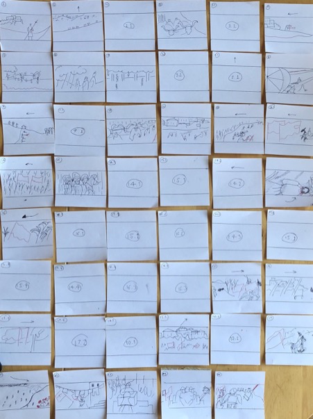
Figure 1. Roberts: two-tone outlines of opening battle sequence in The Agony and the Ecstasy.
The build-up (shots 1-16): A soldier clutching a polearm staggers across the path of a block of marble being transported along a quiet country road toward Michelangelo’s workshop. The bloodied armour and spear makes a diagonal line with the red roadside flora. We then cut twice to a very long shot of red flags peeping over the horizon line, each time getting closer. A red flag runs diagonally from screen right to left, road still in the foreground (Figure 2).
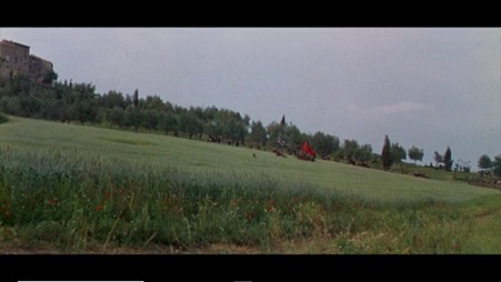
Figure 2. A distant red flag runs diagonally from screen corner right to left, as do the red flowers in foreground
The cavalry charge (shots 17-42): The subtle transformation of the mise-en-scene through geometric colour placement gives way to pyrotechnics when the crimson Papal banners arrive in the foreground during the cavalry charge (Figure 3), forming a widescreen wall of red. The mounted soldiers chase their enemy through the long grass and there are a few intervening shots of blood-soaked swords and wounded knights in medium shots and close up.
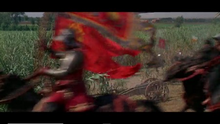
Figure 3. A wall of red: bare shapes as crimson banners loyal to the Pope cross the foreground.
Final assault (shots 43-47): A very long shot demonstrates the scale of the loyalist assault. Foreground bottom-right, red flowers extend outwards, like a mirror image of the confluence of bodies below (Figure 4). The focal point of the flowers perceptually tightens the movement of the troops who swarm like worker bees to nectar, underscoring their common goal. [2] The soldiers then spiral around the square with banners in hand, where the Pope orates from a central pedestal.
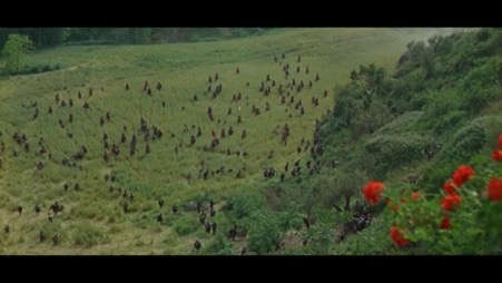
Figure 4. Red flowers extend outwards, a (focal) point of confluence for the advancing soldiers far below.
Discussion: The Changing Pace of Composition in Widescreen and Colour Film
In The Power of the Center: A Study of Composition in the Visual Arts, Rudolf Arnheim argues it is fundamentally difficult to appreciate visual composition in film. Important centres of interest are constantly moving, and, moreover, the oblivious viewer risks being moved along with them: ‘he surrenders to the action’. [3] ‘Visual composition’, Arnheim concludes, ‘reveals itself more readily in the quiet detachment from time, found in the immobile works of painting or sculpture’. [4] Arnheim does not consider historical developments in film technology and style, however, which have altered the film experience. Mid-century widescreen filmmakers repeatedly relied on the efficiency of composition.
The norm has been to describe widescreen composition in relation to the long take style of directing rather than in rapidly edited films. The approach of shooting continuous action from a fixed perspective was particularly prominent during the early 1950s, due to technological restrictions and concerns about jolting the audience when using quick cuts between oversized images. Through careful staging of actors, lighting, and colour placement, filmmakers could guide the audience’s attention across the expanded frame to salient details in lengthier takes.
Other directors sustained their long take style in the widescreen era through more elaborate compositions. Charles Barr upheld Otto Preminger and Nicholas Ray for allowing visual detail to arise gradually out of a complex scene, without cueing the audience through close-ups [5]. What Barr described as a ‘gradation of emphasis’ across the widescreen is seen for example with the Pope’s return to Rome in The Agony, which is discreetly announced when one official points wordlessly to a red line of cardinals confined to a corner of the frame (Figure 5). We are forced to intuit the gravity of the event from the surrounding atmosphere.
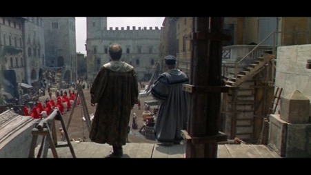
Figure 5. Gradation of emphasis: cardinals discretely flow through the city – the officials sense their presence (as do we).
On average, the audience was given less time to appreciate individual shots from the late 1950s. Few filmmakers seemed concerned with continuity problems or of allowing the eye to gradually explore the frame, as cutting rates in widescreen films sped up. [6] The Agony, while exemplifying the familiar tendency for shots to be faster and closer during scenes of military conflict, also shows how compositional techniques that are of interest in isolation can form a pleasing sequence of entrapment, commotion and confluence in this later period.
The lateral criss-crossing of the field during the build-up, introduced via eyeline cuts, presented a closing net from the anxious perspective of the workers transporting the marble. Filling the widescreen with vivid colours during the cavalry charge amplified interceding touches of actual violence – I was also reminded of a similar technique in Bigger than Life (Nicholas Ray, 1956). The subsequent corner arrangement of flowers, meanwhile, offered a neat chromatic bridge between shots of the crimson banners moving toward the city centre (screen left to right) and a corrective to the chaotic cavalry movements beforehand.
Sketching out shots was my attempt to grasp the almost subliminal effect on my viewing experience of what turned out to be a series of axial, foreground and mirrored/bipolar arrangements. Analysing composition in widescreen and colour film will always revolve around the simple question of relating part to whole. As my research transitions from the 1950s and towards the quick-fire styles of the 1960s, I suspect the cumulative effect of certain widescreen sequences will increasingly demand attention as something other, if not greater than, their shot-components.
Author: Steven F Roberts, PhD Candidate in the Department of Film and Television, University of Bristol. Please contact sr15732@bristol.ac.uk or tweet @Steve_f_Roberts with questions or comments. Follow on Twitter or visit https://bristol.academia.edu/StevenRoberts for updates on widescreen cinema and film history.
Endnotes:
[1] A CinemaScope version was also made for general release purposes. The film was viewed in Todd AO standards at the 2016 Widescreen Weekend in Bradford. For information about future film festivals, see the NSMM website: https://www.scienceandmediamuseum.org.uk/
[2] Perhaps one job of composition is to co-opt otherwise inconspicuous objects. When the Pope enters the square victorious, colourful drapes can be seen festooning the streets like a festival. On closer inspection, the drapes are in fact items of laundry strung between buildings, but the basic shape of the image has already left an impression.
[3] Rudolf Arnheim, The Power of the Center: A Study of Composition in the Visual Arts (Berkeley, CA: University of California Press, 1988), 214.
[4] Ibid.
[5] Charles Barr, ‘CinemaScope: Before and After’, Film Quarterly 16, no. 4 (1963): 4-24. Barr is describing a phenomenon in the historical development of film style, albeit with definite aesthetic criteria in mind – the word ‘subtle’, for example, is used repeatedly in this article. When Barr employs the word ‘composition’ in his analysis of The True Story of Jesse James (Nicholas Ray, 1957), it is among other reasons to illustrate how CinemaScope adds realism (p.11). More overt visual patterns understandably diverge with Barr’s criteria.
[6] David Bordwell, Poetics of Cinema (London: Routledge, 2007), 304.
