During the Global Colour and the Moving Image Conference (10-12 July 2019), hosted by the University of Bristol as part of the AHRC-funded Eastmancolor Revolution and British Cinema, 1955-85 project, a special screening of John Boorman’s Point Blank (1967) at Bristol’s Watershed Cinema rounded off the events of the first day of the conference. The screening was to include an introduction from the Eastmancolor project’s Keith M. Johnston (University of East Anglia) and a Q&A session following the film with the director, John Boorman, who had agreed to travel over from his home in Ireland to talk about Point Blank. The discussion with Boorman was to include his approach to colour in his other films, including Leo the Last (1970) and Excalibur (1981), and his time spent in Bristol as head of the documentary unit at BBC Bristol prior to his move into feature films. Throughout his career, Boorman’s work demonstrates a distinctive approach to the construction of an aesthetic for which colour has played an integral role, adopting a series of innovative techniques in his storytelling process. The screening and Q&A presented an opportunity to talk with a filmmaker whose career has spanned a 60-year period, beginning at a point in which black-and-white still dominated the industry, and how, with a film like Point Blank, Boorman had demonstrated the ways in which familiar monochrome images of black-and-white could be adapted for colour.
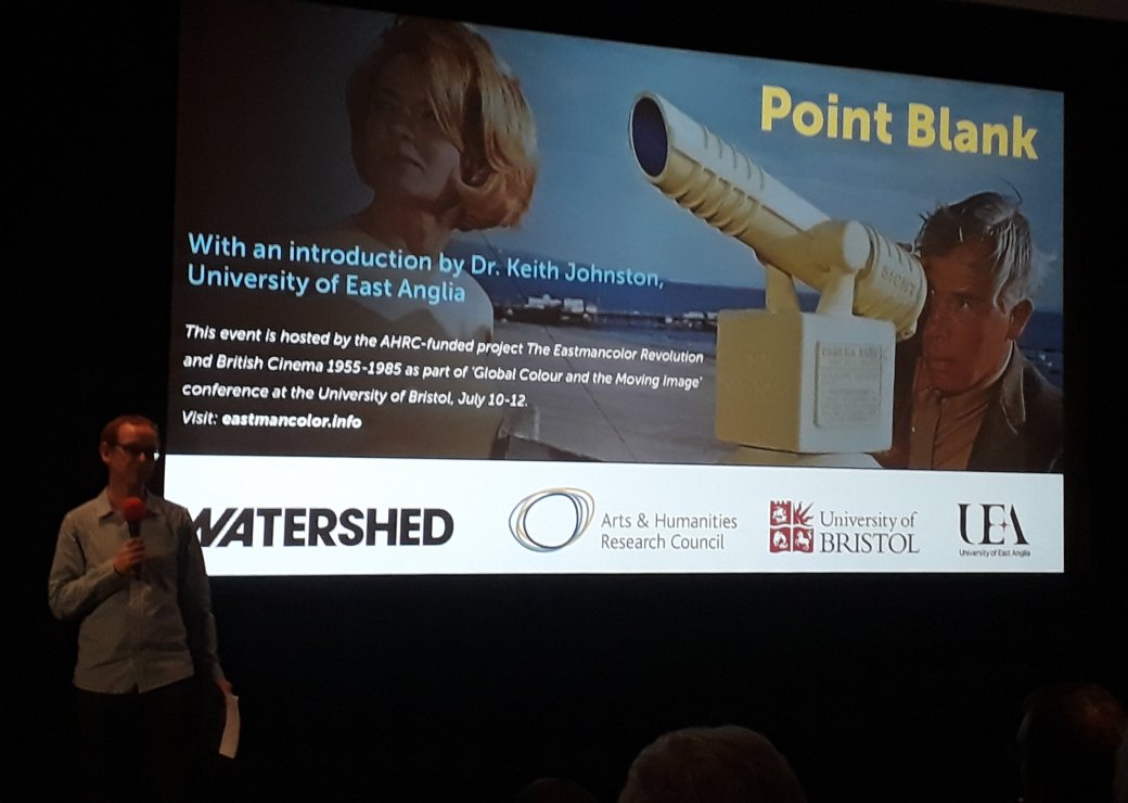
Keith M. Johnston introducing Point Blank (dir. John Boorman, 1967) at the Watershed, Bristol. 10th July 2019.
Following my first email correspondence with Boorman, requesting his involvement at a screening of one of his films, he immediately displayed a keen interest in discussing his work in relation to colour, remarking that ‘I have always been fascinated by colour film stock. It has always been over-saturated and extremely difficult to use artistically. Digital grading has finally solved the problem. We now have complete control over colour’. Boorman pointed out that of all his colour films, Point Blank remains the most interesting due to the challenge of shooting film noir style ‘which cried out for black and white’ in colour. We agreed that Point Blank, as Boorman’s first colour film and his first feature for a US studio, would be a good choice for the screening and anticipated further valuable insights into the challenges of taking this unusual approach to colour design when working for a studio that was not entirely in favour of his experimental ideas.
Once word had been received from Boorman about his involvement and the film that he considered most suitable for the screening, there was a decision to be made regarding which format the film would be presented in. The Watershed Cinema confirmed that a good quality 35mm print of the film and a remastered Digital Cinema Package (DCP) were available for hire, each of which offered certain advantages over the other. The benefits of the ‘authentic’ viewing experience of the 35mm print presented a number of other issues, such as image fading and print wear and tear, while the remastered DCP, though lacking the uniqueness of film-on-film, offered a representation of how the film was originally intended. As Boorman would be commenting on the film during the Q&A, the decision was made to leave it to him to make the choice between the two, with the DCP being the preference as he believed that this version was more likely to have ‘truer colours’ than a print.
Unfortunately, due to unforeseen circumstances, the director was unable to join us for the screening. However, he did share with us some of his experiences working on the film which Keith M. Johnston included in his introduction to the screening in lieu of the Q&A. The following text has been adapted from the author’s correspondence with John Boorman (2 November 2018 – 5 July 2019) with some additional material from Boorman’s audio commentary for the 2005 DVD release.
Boorman’s intention when starting work on the film was to use similar techniques to the film noirs of the 1940s, particularly the use of lighting developed by German expressionists. However, he discovered that using light in a similar manner for a colour film was unachievable at the time as reflected light was required to take the heat (or intensity) out of the colour. It was only later, when cinematographers such as Geoffrey Unsworth and David Watkin started using filters to soften the light, that this became easier. So in Point Blank, the effect of black-and-white cinematography was achieved through the use of monochrome colour designs, with the lighting choices employed being somewhere between black-and-white and colour.
The film’s star Lee Marvin, who portrays protagonist Walker, gave his full support to Boorman during production, allowing him a freedom uncommon to a young British director working on his first US film. Marvin’s commitment helped Boorman to achieve the film noir look he was after, adopting a single colour for both the costumes and the set design in each scene, with the colours taking on warmer tones as the film progresses. Point Blank begins with the cold metallic greys of the prison and his ex-wife’s home, through to the green/blues of the Organization offices, and the yellow/orange of Reece’s penthouse. In the build up to the penthouse sequence, as Walker and Chris (Angie Dickinson) plan their entry into Reece’s guarded apartment complex, Walker uses a coin-operated telescope to survey the building. The canary-yellow telescope, which matches the hues of yellow in the costume worn by both characters, was actually painted on location by the crew and taught Boorman a valuable lesson: to always carry tins of paint with you when on location to help tone down or eliminate obtrusive objects that might otherwise distract audiences or change how the film might be interpreted.
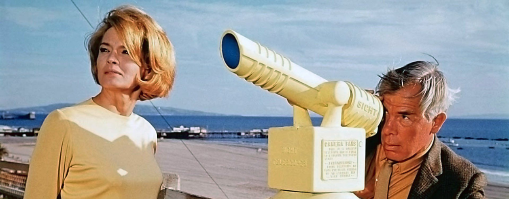
Colour design and the ‘canary-yellow telescope’ in Point Blank (dir. John Boorman, 1967).
Boorman encountered some specific issues when filming Point Blank in colour: while black-and-white ‘wraps its images in harmony’ colours clash, the visual impression of which seems to take longer to decay on the retina. As a result, edits between different scenes were carefully constructed so that the lingering impression of a particular colour on the eye did not diminish the transition to a shot that featured a different colour palette. Boorman favoured filming at night for Point Blank as the darkness takes a lot of the colour out. Due to the design of Kodak film stocks, which were intended to flatter Caucasian skin-tones, the decision to film at night reduced the otherwise saturated colours of the image.
During production, the head of the art department wrote a memo to the head of MGM saying that the film would be impossible to release in its current form, citing a primary concern as a scene at the Organization: this scene featured several men in green suits and ties against green backgrounds. In an attempt to reassure MGM, Boorman suggested that the photographic emulsion reacts in different ways to the various shades of green, with some veering more towards yellow or brown in the final print. Boorman believed that his art director on the film was very conventional and not particularly imaginative, but he ensured that everybody attended to the approach to colour he wanted without discrepancies.
John Boorman would also go on to create a similar monochrome effect working alongside cinematographer Peter Suschitzy on Leo the Last (1970), painting the exteriors and interiors of a derelict London street in black-and-white which left only the colours of the actors faces to stand out amongst their surroundings. Though many filmmakers embraced the widespread adoption of colour cinematography in the late-1960s, some were resistant to this change, resulting in a number of imaginative attempts to manipulate the new colour film stocks in order to recreate the qualities of black-and-white stock. As a result, films such as Point Blank and Leo the Last sit alongside other notable productions from this period, including Ken Loach’s work with cinematographer Chris Menges, which serve as a reaction against – and creative response to – some of the perceived negative qualities inherent in the early Eastmancolor film stocks.
Bio notes: Paul Frith is a post-doctoral research associate on the AHRC funded project ‘The Eastmancolor Revolution and British Cinema, 1955-1985’, based at the University of East Anglia (UK). In 2014, he completed his thesis on horror and realism in Britain during the 1940s, with publications on this subject appearing in The Journal of British Cinema and Televisionand Horror Studies. His research specialism is in British cinema with an emphasis upon censorship, horror, and amateur filmmaking. He is also the co-author of Colour Films in Britain: The Eastmancolor Revolution to be published by Bloomsbury in 2021. Contact: paul.frith@uea.ac.uk
