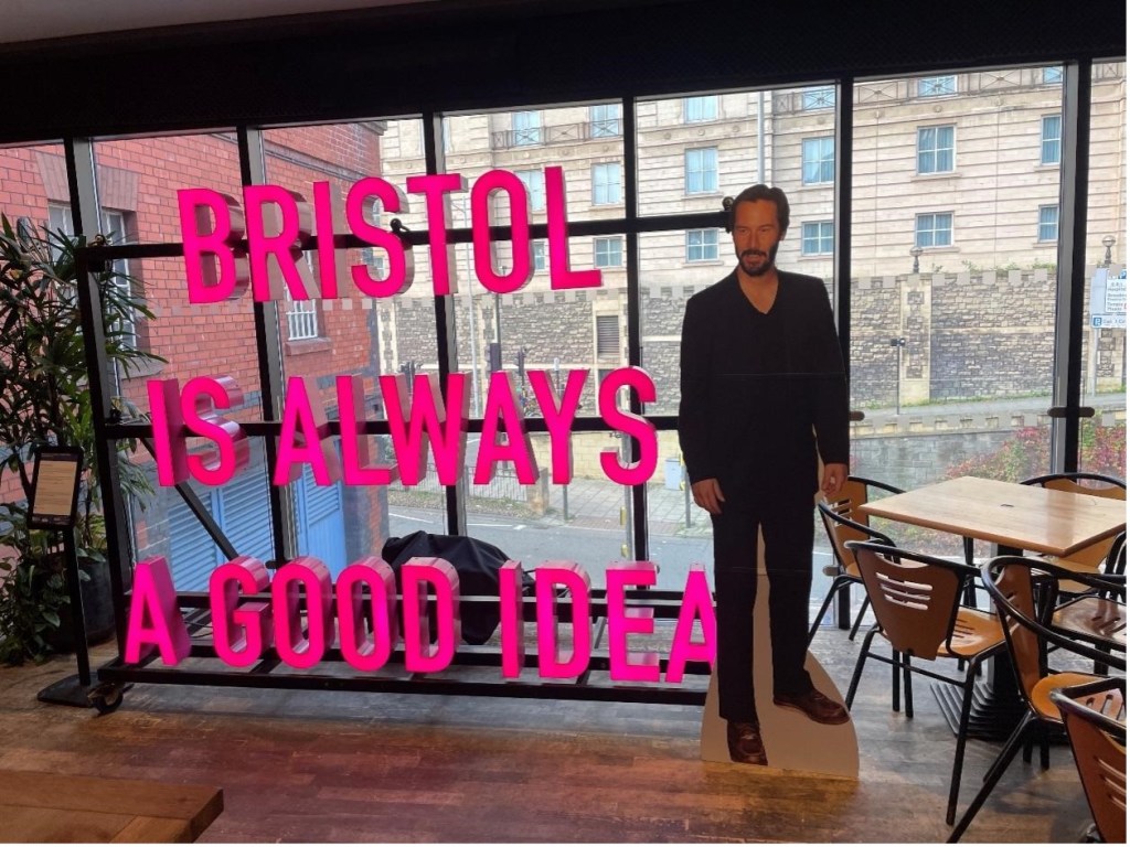
The 8th International Color Conference opened in Bristol this year, after scheduling complications necessitated a shift from the originally planned London location, where previous iterations of the annual conference have been held at the British Film Institute on the Southbank. Yet we were still riverside at the Waterside Cinemas, and the city of Bristol is a fascinating location with a storied colonial and maritime history, deeply entwined with the history of slavery and colonialism. Masterfully organized again by Elza Tantcheva-Burdge, Ulrich Ruedel and Sreya Chatterjee, this year’s theme on television was combined with a continued focus on archives and restoration, as well as additional papers on cinema and color. Extra-curricular activities prefaced the conference with Mark Fuller’s guided tour of Bristol’s historic cinemas, and a double feature Cinemascope screening of Hans Hass’ newly digitized Unternehmen Xarifa (Under the Caribbean, 1954) and Pierre Levie’s The Great Barrier Reef, 1969), the latter of which was introduced by Kathryn Millard, in an opening reprise of the Underwater theme of last year’s conference in Vienna.
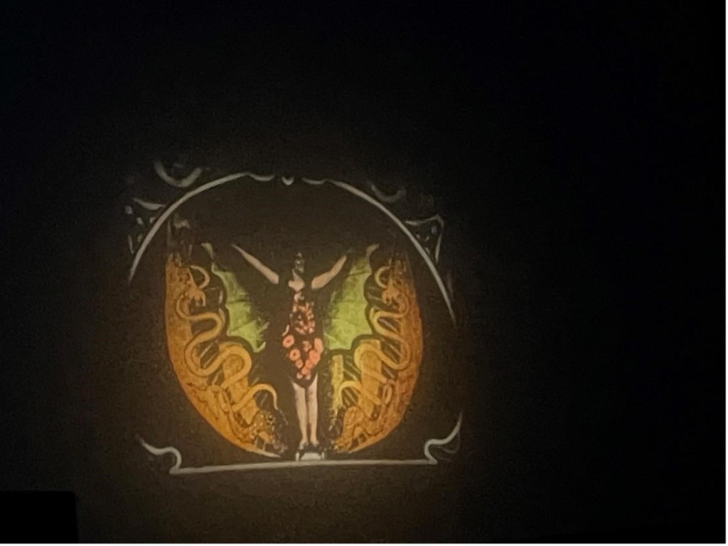
What makes the conference so enriching is the variety of approaches featured each year, ranging from traditional analytical papers which focus on historical research and aesthetic analysis, to the more technical presentations that examine problems of archival restoration or curation from Bruno Mestdagh, Giorgio Trumpy and Charles Poynton, to the marvelous archival screenings and displays of rare projection equipment and cinematic gauges, with beautiful musical accompaniment by Andreas Benz. This year, a singular opportunity was seeing several cinematic delights by Michael Powell, in 4K restorations from the BFI: The Sorcerer’s Apprentice (1955, 13 mins), the first ballet film shot for Cinemascope, which was shown on German television, as well as Bluebeard’s Castle/Herzog Blaubarts Burg (1963, 62 mins), an adaption of Bartok’s opera with a lively color palette, and avant garde costume design and staging, also for German television. Kieron Webb introduced Charles Friese Green’s travelogue The Open Road (1926) and other screenings included the Moulin Maudit /The Mill (Alfred Machin, 1909). Another rarity were Rosie Taylor and Stefanie Benz’s 9.5 mm films projected on a Baby Pathé: a cornucopia of miniature colored gems, from serpentine dances to dramas (again with musical accompaniment by Andreas Benz, see figure 2).
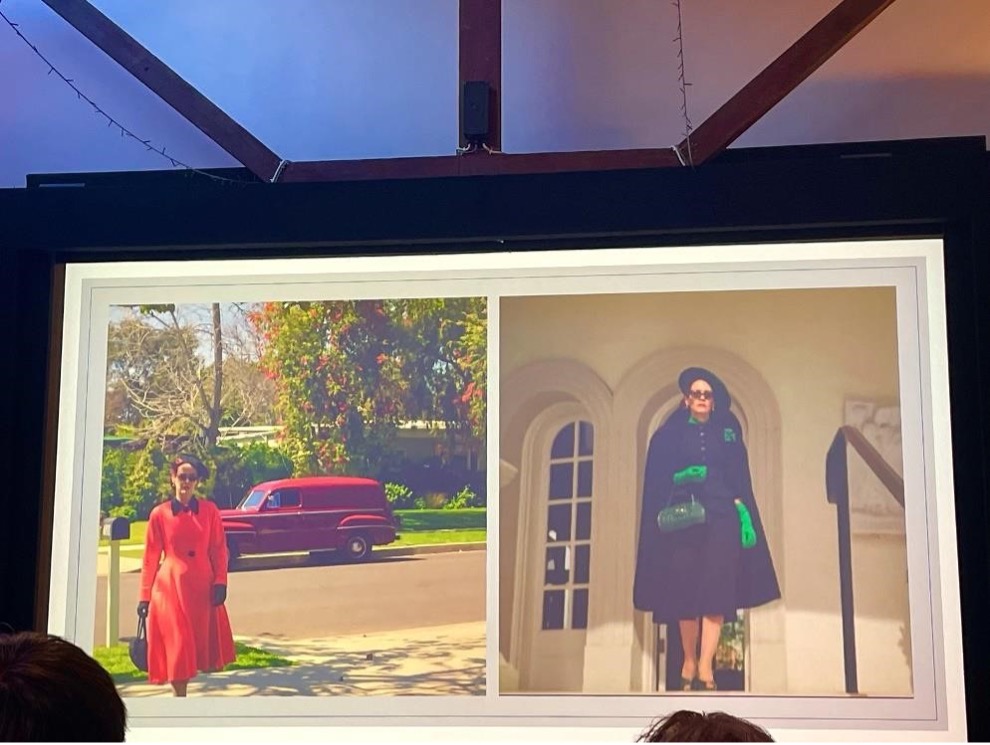
The conference began with Sarah Street’s keynote on the Ryan Murphy TV series Ratched, which explored the show’s striking color palette in light of wider critical debates in television studies around the contested term ‘cinematic television’ or how television and cinema mutually inform each other as assemblages of intermedial narratives in dialogue with color and set designs, such as the work of Dorothy Draper. Street’s examination of the “spectacularly chromatic” strategies in Ratched, including its single color lighting schemes (especially ghostly green) and stylized costumes suggested a new ‘color consciousness’ as Street noted, where color produces an unsettling, affective response in the viewer in excess of symbolic meaning.
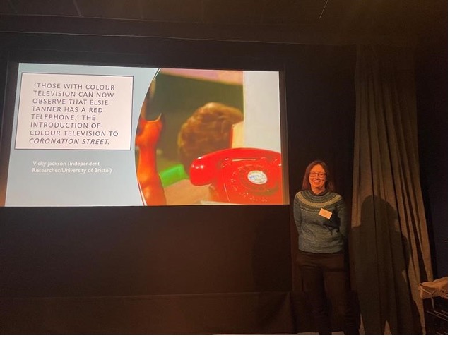
Vicky Jackson’s exploration of Coronation Street’s shift to Color in 1969, showed us Elsie Tanner’s red telephone and Ena Sharples green eyes (see Figure 4) and pointed to the recalibrations of the cameras necessitated by the widespread reviews which critiqued the garishness of the sets, and in an examination of the variability of color reproduction of the same sets across 2 different episodes from 1969.
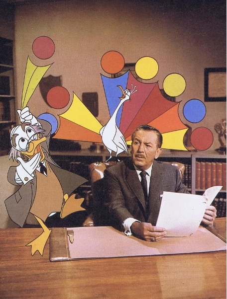
My own paper on Ludwig Von Drake examined the relationships between Disney, RCA and NBC and suggested that educational and sponsored film and media and the studio’s daffy Professor-Duck played a complex Möbius relationship in the studio’s history, shaping the aesthetic design of the studio’s intellectual property, while also funding and cross promoting the studio’s theme park and color television innovations (See Figure 5). Bryony Dixon’s introduction to a screening of natural history films offered a continued focus on the colors of non-theatrical film through scientific films.
Sreya Chatterjee’s paper on colorization gave a richly researched historical overview to the attempts to recolorise black and white cinema on television, from Wilson Markle and Image Transform to Norman & Earl Glick and Hal Roach studios in the 1970s, through to the better known attempts of Ted Turner in the 1990s, while she also pointed to her research that revealed the patents developed for these processes(see Figure 6). Meanwhile, Kirsty Dootson’s presentation of the BBC’s shift into color explored the relationship between color as a “synonym for racial difference” and color as technological change, in the historical context of postwar Britain, in which changes in immigration and cultural values shaped and informed shows like the Black and White Minstrel Show (1958-1978). Her argument can be explored further in chapter 4 of her recent prize winning book The Rainbow’s Gravity: Colour, Materiality and British Modernity (Paul Mellon Center, 2023).

Presentations from archivists offered sample overviews of intriguing materials in television collections in the United Kingdom, in which scholars were invited to further explore. These included the treasures of the National Television Archive curated by the British Film Institute, which has been buttressed by recent agreements they have made with Amazon Prime and with Netflix to acquire streaming material to add to their previous material from ITV and Channels 4 & 5 (the BBC has its own archive here). In particular, Elinor Groom’s witty presentation showed us the many treasures of this archive (including disco dancing reality shows!) and nicely complimented Jonathan Bignell’s keynote presentation of the development of Color TV in Britain. Bignell explored the ways in which the BBC’s determination to offer the best high quality color television system in the world was aligned with a broader techno-nationalism, underscoring how developments in color technology were deeply ideological and aligned with national taste and cultural values. His presentation also examined the costume drama miniseries Vanity Fair directed by David Giles in 1967, whose content as the first drama serial produced in color by the BBC formed a serendipitous historical echo of the Rouben Mamoulian feature Becky Sharp (1935), first released in Technicolor IV.

In the third keynote Charles Poynton’s talk pondered the more technical question of what could be considered to be authentic or faithful display through the mastering, distribution and interpretation of image metadata (See Figure 7). From Belgium, Bruno Mestdagh presented the Royal Belgian Film archive Cinematek’s establishment of Digilab which is focused on converting earlier analogue versions of archival materials like the work of Chantal Akerman into digital copies for DCP projection. Giorgio Trumpy also gave an overview of Scan2Screen’s current work, which has included recent work for the Academy of Motion Pictures Arts and sciences, for which I also gave an overview of the current Color in Motion Exhibition at the Academy Museum in Los Angeles, and for which the catalogue is now available (with essays by Advisory Board members Joshua Yumibe, Ranjani Mazumdar, Kirsten Thompson and Barbara Fluckiger, as well as Sarah Street).
This year’s Color TV theme opened up new research avenues with television, digital and streaming media. As with all the previous annual conferences, it offered rich surveys of key archival collections for research, and stunning screenings of material from those archives. Next year, the Color Conference will be held in Amsterdam May 25-28 at the EYE in coordination with University of Utrecht and the University of Amsterdam, to celebrate the 10th Anniversary of the Color Fantastic conference and the 30th anniversary of the Amsterdam workshop Disorderly Order: Colors in Silent Film. We hope to see you there!
Kirsten Moana Thompson is Professor of Film and Media and Director of the Film and Media Program at Seattle University. She teaches and writes on animation and color studies, as well as Pacific, and American studies. Recent work has focused on the animated ‘useful’ film; intersectional animated surfaces in Moana; the material color history of Disney 2D animation and the ink and paint department, and Ludwig von Drake and the Disney promotional film. She is the author of the award-winning Animation and Advertising (co-ed. M. Cook, Palgrave, 2019), the first book to examine the relationship of animation with non-theatrical media. She has also published Apocalyptic Dread: American Cinema at the Turn of the Millennium (SUNY Press, 2007); Crime Films: Investigating the Scene (Wallflower: 2007), and coedited with Terri Ginsberg Perspectives on German Cinema (GK Hall: NY, 1996). Other recent work includes “Tattooed Light and Embodied Design: Animated Surfaces in Moana” eds. Paula Massood et al in Media Crossroads: Intersections of Space and Identity in Screen Cultures (Duke UP, 2021), as well as essays on Aggie Grey and Tourism; the material color history of Disney and Faber Birren; Ludwig Von Drake and the Disney promotional film, and the animated advertising spokescharacter Reddy Kilowatt. She is currently working on three new books, Color, American Animation and Visual Culture, 1890-1960; Bubbles; and Animated America: Intermedial Promotion, from Times Square to Walt Disney.